-
by Joy Thompson
YouTube updated it’s logo, and unlike other major tech company logo changes, this change was made with very little outrage. The reason there wasn’t a backlash was because the logo tweak makes a lot of sense. In fact, I wonder what took them so long.
In case you can’t remember what the now-old YouTube logo looked like, here’s the old and the new side-by-side…

The new logo puts emphasis on the super recognizable red play icon. Take the words off the logo, and people would still recognize the brand. The red play icon also connects with the colorful Google Play icon, creating cohesiveness across Google-owned properties:

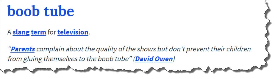
The other big reason for the switch was because the old logo put too much emphasis on “Tube,” which is an old-timey nickname for TV. YouTube has evolved well-beyond traditional “boob tubes” and it doesn’t make sense to associate the brand with old tech.

So, all in favor of the new YouTube logo?
Aye! Aye! Aye! Aye! Aye! Aye! Aye! Aye! Aye! Aye! Aye! Aye! Aye! Ruff! Ruff! (that’s 13 “ayes” from the humans at Exults, and 2 barks from the office dogs)
Other Major Logo Changes
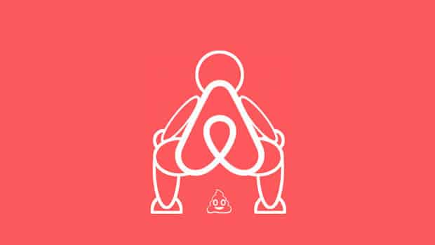
Companies have their reasons for updating their logo. That doesn’t mean that consumers can’t make fun of the change. Exhibit A: AirBnb
AirBnb’s logo update was one of my favorites because of the creative backlash.
Let’s be real… the old AirBnb logo looked like an airbrushed tee in the 90’s. Their new / current logo is clean, modern, simple, and app icon-friendly. That didn’t stop the trolls though.
Here are 2 of my favorite AirBnb logo parodies.
Side note: I couldn’t include most of the logo parodies because they’re very NSFW. You’re smart though– use your imagination.


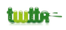
Moving on. Twitter’s logo didn’t always feature the blue bird. It had a lot of that “bad graffiti” / “gas station hat” quality that the original AirBnb logo had.

We don’t even need to discuss why Adidas had to change their original logo (yikes).

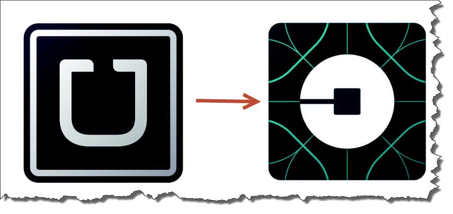
Remember when Uber’s biggest issue wasn’t sexual harassment or a trending hashtag (#DeleteUber)– it was users complaining about their new logo.

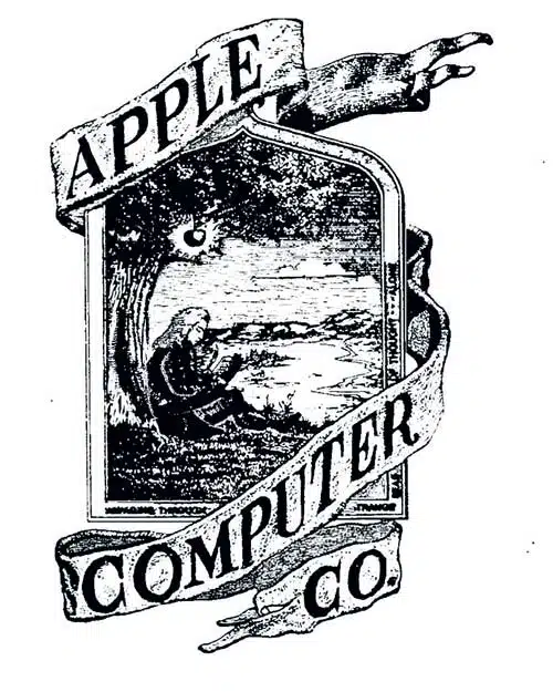
It’s ironic that the company most associated with sleek design, Apple, used to have this as their logo.

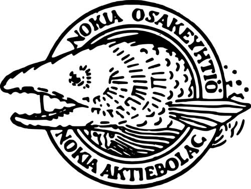
Nokia’s original logo could work today… if they were a hipster seafood restaurant.

I don’t care if it was only $1, Proctor & Gamble most definitely overpaid for this logo in the 1800’s.

The Exults Logo Change
Even Exults had a different logo. Over a decade ago (yes, we’re celebrating our 10th year in Fort Lauderdale!), this was the company logo:

If it wasn’t already evident, our logo change was also a company name change. The reason for the change was that we became so much more than just an SEO company. We began specializing in PPC, social media, and e-commerce. The old company name and logo was too one-dimensional.
Wrapping up
I encourage you to scour the web for old company logos– it’s a blast. I only included a few of our favorites on this post, but when you get a chance (or don’t feel like working) take a look at the original logos for Mozilla, Microsoft, Starbucks, IBM, McDonald’s, Burger King, Shell, Ford, Pepsi, and Instagram.
What are your favorite logo changes? Need help with your branding? Don’t hesitate to reach out.